
Color, soft edges, and stillness turn a record into a memory
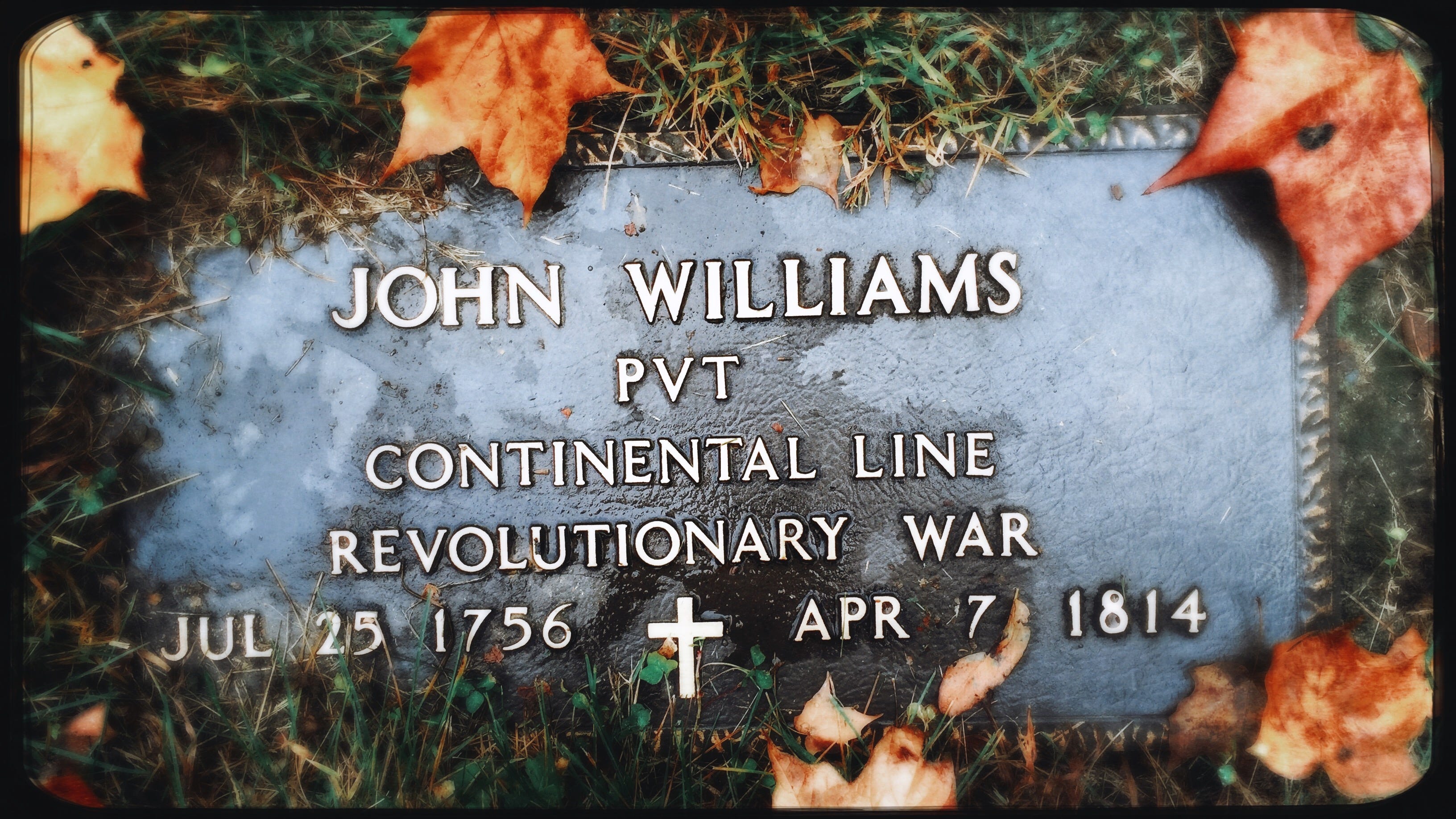
I’ve spent several years photographing the gravestones of Revolutionary War soldiers in and around Westerville, and the longer I do it, the more I return to certain markers that seem to ask for another look. Only a few have modern stones like this one, for John Williams in Copeland Cemetery off Yankee Street near Sunbury Road. I’ve visited this marker many times, but this is the best photograph I’ve made of it.
I wanted this photo to remain simple, letting time do the heavy lifting. On the surface, it is a grave marker photographed straight on, surrounded by grass and dry leaves. But I was not interested in making a record shot. I wanted the frame itself to give the marker more weight. By letting the stone fill most of the image, I made the text the subject immediately. The leaves at the edges are not clutter. I used them as a natural frame. Their warm oranges against the cold gray stone created the emotional split I was after: life and season pressed against permanence and death.
What mattered most to me was restraint. I did not want a dramatic angle or a forced, attention-seeking moment. I wanted the image to feel steady, quiet, and honest. So I relied on careful placement, soft falloff around the corners, and enough texture in the grass and stone to make the scene feel worn, old, and human.
I was also thinking about rhythm. The lettering falls into clean horizontal bands, giving the image structure, while the leaves break that order just enough to keep it from feeling stiff. The largest leaf in the upper right pulls the eye outward, while the large name at the center pulls it back. That push and pull creates movement even though nothing in the frame is moving.
The slightly dreamy rendering was part of that decision too. I did not want the image to feel purely documentary. I wanted it to feel closer to memory than evidence. That felt right for the subject. A grave marker is factual, but remembrance never is. Memory softens things. It blurs edges. It carries feeling as much as information.
The main lesson for me in this photograph is that mood often comes from control at the edges. I kept the center clear, readable, and stable, then let the perimeter go darker, softer, and more organic. That contrast directs attention without depending on aggressive blur or shallow depth of field.
Color is doing important work here. The orange leaves set the season, establish the emotional tone, and create visual entry points into the image. By getting close and excluding the wider cemetery, I removed distractions and made the marker feel more intimate, almost like a portrait of absence. The top-down viewpoint matters too. It flattens the scene, emphasizes text and texture, and keeps the image grounded.
What I take from this image is simple: fill the frame with what matters. Use edge detail to support the subject, not compete with it. Let warm and cool color contrast carry emotion quickly. Trust a centered composition when the surrounding elements create enough tension. Use texture to bring in age, place, and credibility. Let softness serve a subject rooted in memory. Exclude the wider scene when intimacy matters more than context.
As July 4 approaches, I will share more examples from this project. That feels important to me, not just as a photographer but as someone who knows these markers are never merely historical objects. They deserve to be understood and treated with respect, because they were as important then to the soldier’s family as the markers we place for those lost in today’s conflicts. I know that personally. My son, a combat soldier born in Georgia, lies in a small field near Ohio Civil War soldiers, where they now share the same ground and, I hope, the same respect for their sacrifice.

My Final Photo News is a reader-supported publication. To receive new posts and support my photography and commentary, become a free or paid subscriber. Subscribe to The Westerville News and PhotoCamp Daily.