
When Color Is Required
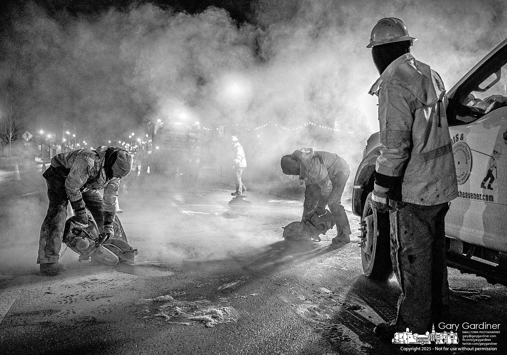
After completing yesterday’s newsletter, “What Gets Published?” I wondered how well the photo would work in black and white. I’ve previously written about how much I prefer black and white over color for some photos, especially workers and laborers.
I wrote in a newsletter almost a year ago, “Consider that the reason I prefer black and white for construction photos is specifically to remove the visual focus on the neon-colored safety clothing—colors designed to attract attention.
“Color sometimes overwhelms a scene with too much information, leading the viewer's eye away from the primary subject. Black and white simplifies a scene and ensures that the story you wish to tell is communicated more directly and powerfully.”
Reducing Information To The Essentials

I continue to be fascinated by a series of black-and-white photos I’ve made of construction workers.
Having committed to the mantra that black and white removes distraction and simplifies visual focus, allowing the viewer to concentrate on composition and timing, I must now admit sometimes that doesn’t work.
The black-and-white photograph transforms the scene by emphasizing texture, contrast, and atmosphere in a way that differs significantly from the color version. The color version transforms the composition into a more dynamic and visually engaging scene by introducing a striking interplay of warm and cool tones that enhance depth and separation between elements.
In black and white, the image relies solely on tonal contrast to define the workers, the haze, and the background, creating a strong but uniform aesthetic where the details blend into an overall gritty, high-contrast composition.
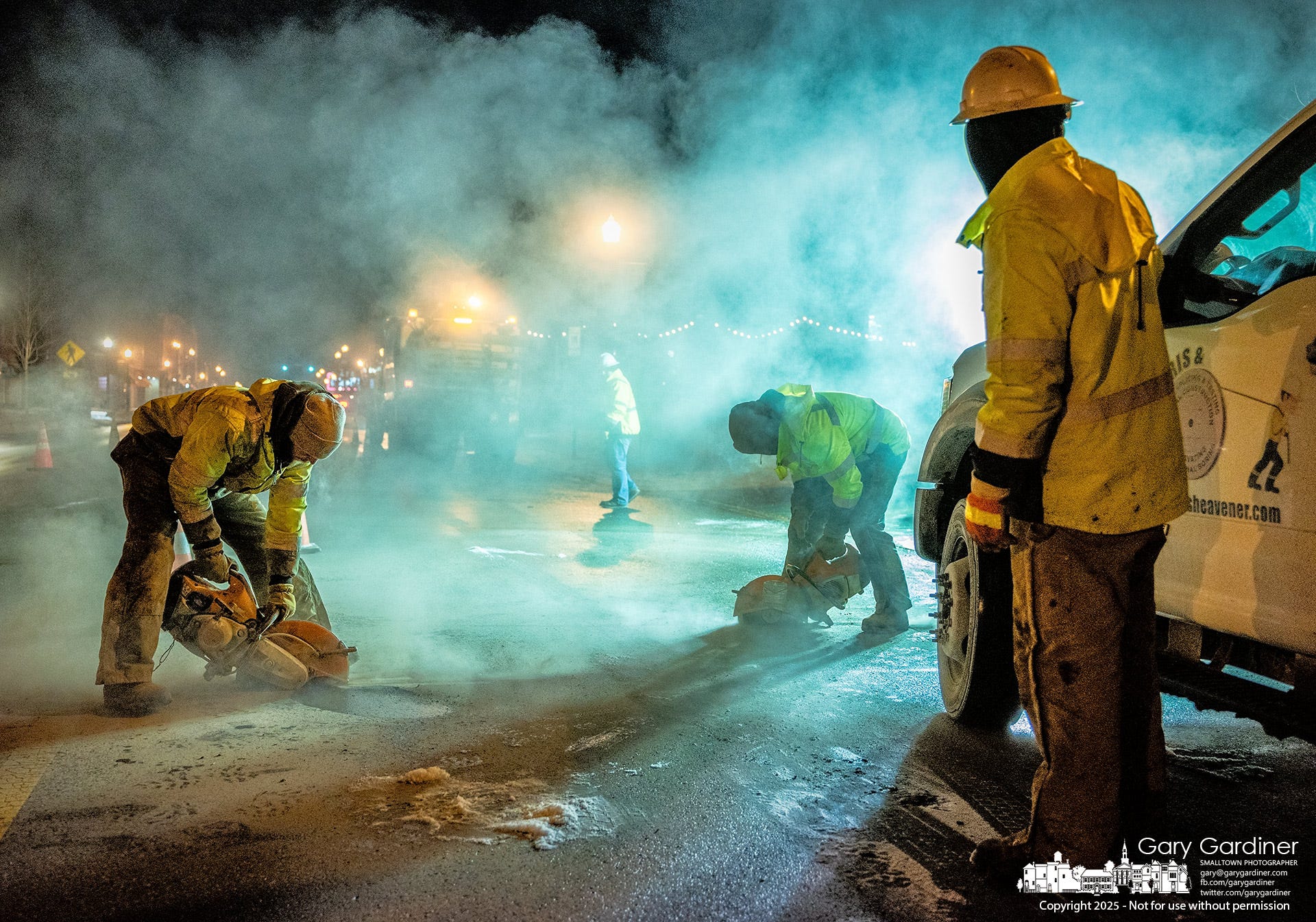
However, in color, the warm orange glow of the street lights contrasts sharply with the cool blue-green hues of the smoke, making each layer of the image more distinct. The workers' high-visibility jackets pop against the darker environment, ensuring they stand out as focal points. At the same time, the reflective pavement amplifies these color contrasts, adding another layer of depth.
The blue-green cast within the smoke further enhances the cinematic quality, separating the foreground from the background and making the atmosphere feel almost otherworldly.
In this way, color does more than add vibrancy—it actively strengthens the composition by creating clear visual hierarchies, guiding the viewer’s eye through the scene with a sense of movement and space that is less pronounced in black and white. The color palette also heightens the emotional impact, making the environment feel both intense and immersive while still retaining the documentary realism of the original monochrome version.

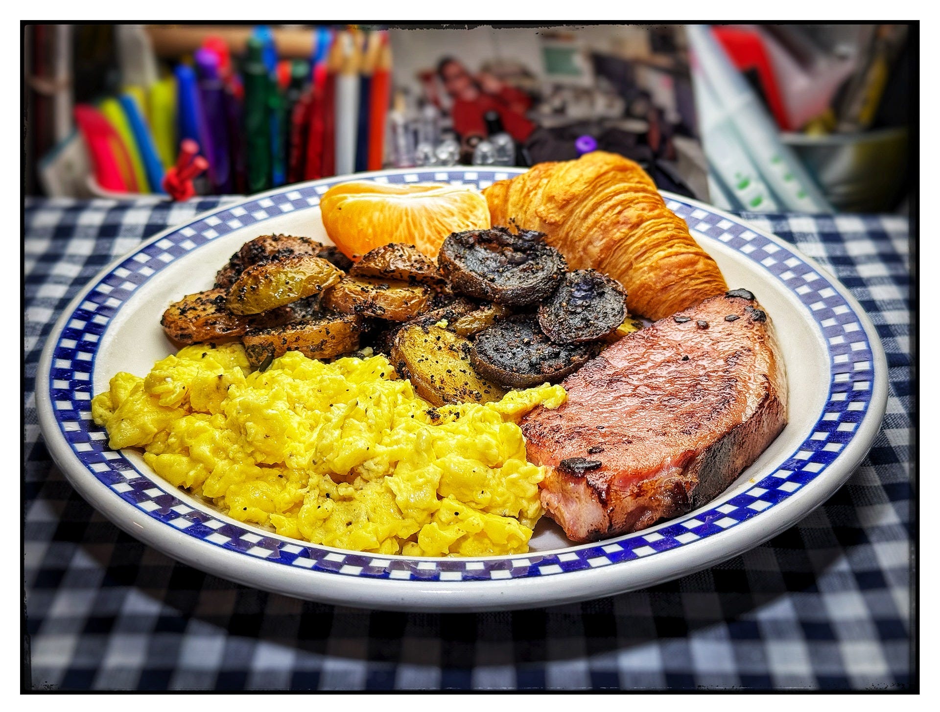
The Blue Plate Special Kitchen
Today’s Blue Plate Special Kitchen offers breakfast: scrambled eggs, fried ham steak, home fries, a small croissant, and orange slices.
The scrambled eggs were fluffy and perfectly cooked, their vibrant yellow hue against the darker tones on the plate’s edge. With its rich sear, the ham steak had a rustic appeal, suggesting a satisfying taste. The home fries were well-seasoned, with a mix of crispy golden and slightly charred edges, adding depth and texture. The croissant looks flaky and golden brown, offering a buttery, delicate complement to the rest of the meal. The bright orange slice adds a refreshing touch, providing a pop of color and flavor balance.
The meal offers a mix of nutrients, combining protein, carbohydrates, healthy fats, and essential vitamins. The scrambled eggs and ham steak provide a high-quality source of protein. However, due to the ham, croissant, and the cooking method of the potatoes, it leans towards being high in saturated fats and sodium. Balancing it with fresh fruit, whole grains, or a lighter protein would enhance its nutritional value.
Shot on an iPhone. Edited with Snapseed.
The Good Thing That Happened To Me Today
I had just explained to a friend that sometimes all I can find to make a photo of are rocks, trees, leaves, and grass, especially in the first two months of the year when colder weather keeps people indoors and shoppers spending less while they are in financial recovery from Christmas.
All of my photos come from experiencing my surroundings and the actions that are happening within them. When there is little activity, all I see are objects.
Today was one of those object days, with the following two photos representing the best of my abilities.
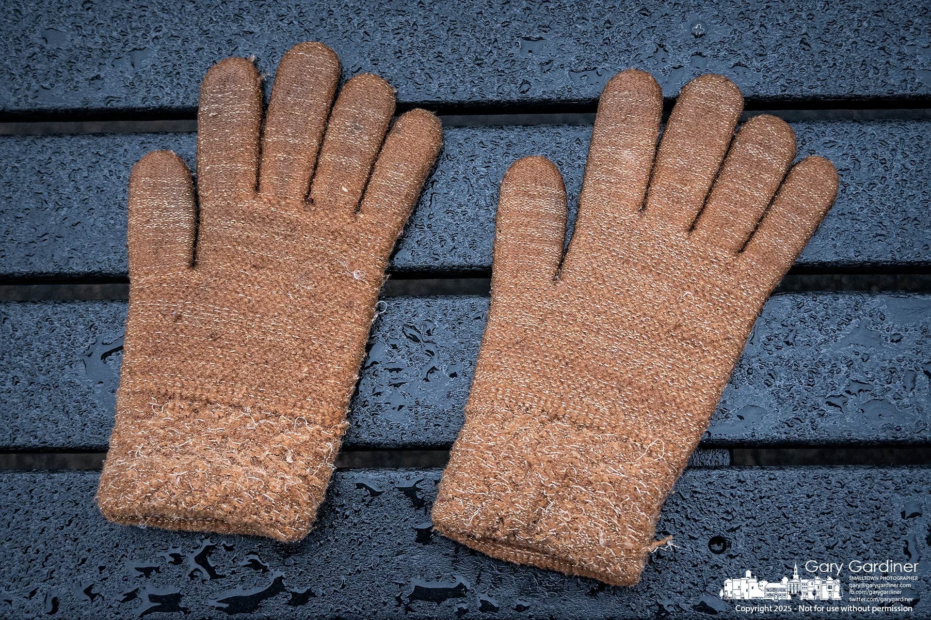
These water-soaked lost gloves sit on a dark, wet plastic bench in front of Good Vibes Winery. The contrast in color and texture drew my interest. The glove’s faded brown fabric contrasts with the deep black surface, the texture rough against the smooth, slick bench made from plastic bags. The moisture darkens the wool, making it appear heavier, while droplets on the bench reflect faint highlights. There is a quiet contrast of materials and tones—soft versus hard, warm versus cold, organic versus synthetic.
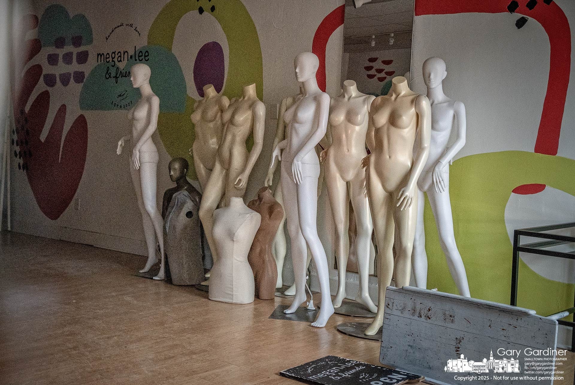
Megan & Friends' storefront on East College is now closed, with its mannequins gathered against the wall. It’s unlikely this would have made My Final Photo because I wouldn’t want to deal with the social media reaction to make mannequins. But I shot it anyway.
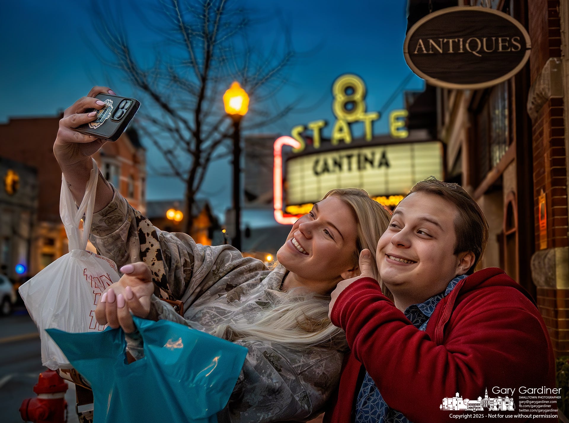
As I stepped out of Good Vibes and turned to go to my car, I found My Final Photo: two friends taking a selfie in front of Westerville Antiques. I photographed their experience and experienced the excitement that people are much better than rocks, trees, leaves, grass, wet gloves, and naked mannequins.
My Final Photo News is a reader-supported publication. By becoming a free or paid subscriber, you receive new posts and play a crucial role in supporting my photography and commentary. Please subscribe to The Westerville News and PhotoCamp Daily.
My Final Photo News recommends its friends, Civic Capacity and Into the Morning by Krista Steele.
